
JavaScript: Intro to Iterative Tools & Data Management
June 2, 2020
Gravitee Setup
June 26, 2020
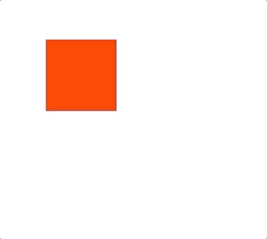
CSS animations are a great way to make your site come alive and give it a next-level look and feel. There are a couple of main ways to do animations. The first way we will look at is using the transition method. You can use the transition property with a width and time value. This first example, when the hover event is triggered on the element, the width will go from 100px to 200px and take 2 seconds.
div {
  width: 100px;
  height: 100px;
  background-color: red;
  transition: width 2s;
}

div:hover {
  width: 200px;
}
You can also have multiple values change and it will run all of the transitions at the same time.
div {
  width: 100px;
  height: 100px;
  background-color: red;
  transition: 3s;
}

div:hover {
  width: 200px;
  height: 200px;
  background-color: blue;
}
You can also target multiple properties with the same transition property and give them different times. This example when you hover over the div, the width of the box will go from 100px to 200px over the course of 2 seconds, the height will go from 100px to 200px over the course of 4 seconds and the color will shift from red to blue over the course of 3 seconds.
div {
  width: 100px;
  height: 100px;
  background-color: red;
  transition: width 2s, height 4s, background-color 3s;
}

div:hover {
  width: 200px;
  height: 200px;
  background-color: blue;
}
The second way to do animations is by making a keyframes function and calling it on your element. The advantage of this is now you have a reusable animation you can use on any element. There are from/to properties that can be used with either unit values or percentage-based references.
div {
  width: 100px;
  height: 100px;
  background-color: red;
  animation: myAnimation 2s;
}

@keyframes myAnimation {
  from {width: 100px;}
  to {width: 200px;}
}
As you can see one of the big differences with this technique is that after it runs it goes directly back to how it was abruptly. There are some modifiers we can add to the animation call to make it behave how we want.
div {
  animation: [name] [duration] [amount] [direction];
}
So to have it run smoothly as we had above you can do something like this.
div {
  width: 100px;
  height: 100px;
  background-color: red;
  animation: myAnimation 2s 2 alternate;
}

@keyframes myAnimation {
  from {width: 100px;}
  to {width: 200px;}
}
This will run the animation twice, each time for 2 seconds once from/to then the second time to/from.

Another neat technique you can use with this method is percentages instead of the from/to properties. It will take the number of your percentage and run each one for that part of the total time. Also, we will have it run top to bottom and then bottom to top with the `alternate` direction value and forever with the `infinite` amount value.
div {
  width: 100px;
  height: 100px;
  background-color: red;
  animation: myAnimation 2s infinite alternate;
}

@keyframes myAnimation {
  22%  {width: 100px;}
  61%  {width: 100px; height: 200px}
  74%  {width: 200px; height: 200px}
  100% {width: 200px; height: 100px}

}
You can now use these techniques to give your site a little extra flair and excitement. A few CSS animations can make your go from looking boring and plain to interesting and professional. Or if you would like someone else to do that for you contact our dev team and get a quote. https://ckhconsulting.com/custom-software-development/

